 WELCOME
This issue of Being Designerly includes curated articles about designing design teams, user-centered design in a business context, empathetic inclusive design, metaverse design flaws, green design principles, and some interesting visualization of rising costs, wealth distribution, and 45 billion dollars!
 FEATURE

Redesigning the design department
What makes for a successful design department? And how do you avoid siloing it from the rest of the business? To answer these questions, McKinsey looked at data from three million designers and design leaders in more than 100,000 design departments, and this .
Jump to page 35 to see recommendations, and then back for the details...
 EMPATHY
Empathetic design is redefining accessibility for people with disabilities and special needs
Design teams at Mastercard and Amazon are among many considering and designing user experience for customers with special needs and disabilities.
 VISUAL COMMUNICATION

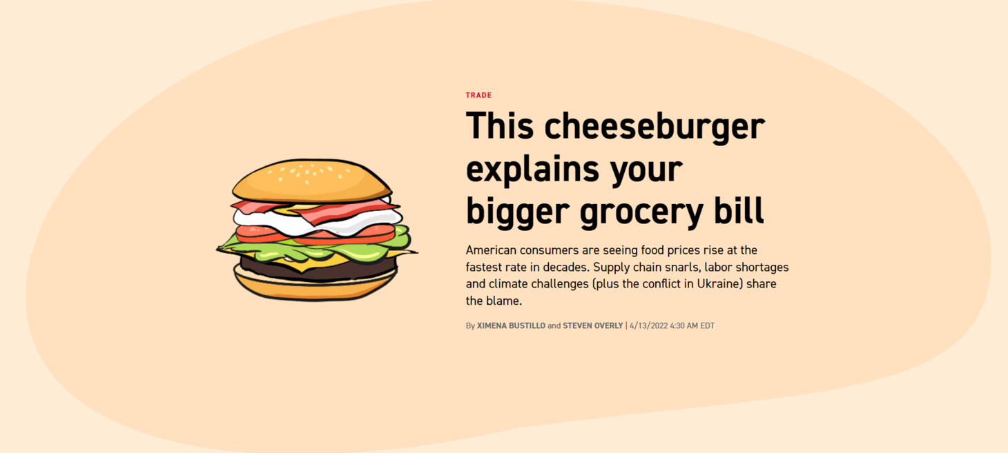
Food prices rising? This cheeseburger explains your bigger grocery bill
This article uses a cheeseburger to visualize and describe the rising costs because of a range of economic forces and geopolitical conditions that are disrupting how our food gets from the farm to our tables.
Come for the visualization, and stay for the content.

Visualizing the Distribution of Household Wealth, By Country
A majority of the world’s wealth is concentrated in just a few countries. In fact, almost a third of household wealth is held by Americans, while China’s population accounts for nearly a fifth.
Using data from Credit Suisse, this graphic by Eleonora Nazander shows the distribution of household wealth worldwide, highlighting the wealth gap that exists across regions.
 UX
UX

A guide to Business-driven UX. Connecting business strategy with user needs
A successful user experience is not only about meeting the exact needs of the users, the end goal is business outcomes. No matter how satisfied the users are with a redesign, if it hasn’t been aligned with the business strategy, there is a great likelihood it will be considered a failure.
Combining user needs and business strategy is the key.

Mark Zuckerberg's metaverse vision has a fatal design flaw
Meta’s promotional vision for metaverse worlds is a series of distinct snapshots, while other metaverse platforms, such as Decentraland, The Sandbox, and Cryptovoxels, feature some level of urban planning. Like in many real-world cities, they use a grid system with plots of land distributed on a horizontal plane. This allows for property to be easily parceled and sold. However, many of these plots have remained empty, demonstrating that they are primarily traded speculatively.

Green Design Principles that every designer can use to combat climate change by Microsoft Design
When we think about combating climate change, recycling or biking to work comes to mind, but not the UX we design every day… But if the internet were considered a country, it would be the 7th most polluting country on earth.
 INCLUSIVE

Google - Belonging
In a world where everyone belongs, anything is possible.
Read about how Google is building belonging through co-creation in products - helpful technology enabling everyone to pursue their goals.

Context helps - a simple visualization of US$45B
Just so you get an idea of how much 45 billion dollars is. - By @AlSweigart
twitter.com