 FEATURE

Work Backward to Drive Innovation Forward
This LinkedIn post summarizes the four steps that Amazon uses to defines the ideal customer experience and then works backward to create it and innovate as highlighted in the book Working Backward.

How DoorDash leveraged a customer problem to create its most successful feature yet
Read about how DoorDash launched DoubleDash, sparked by customer ordering trends they noticed. It allows customers to place a second order within 10 minutes of the first, adding onto just one initial delivery at no extra cost.
Start small and iterate, or bake a cupcake before trying to bake a wedding cake...
 EMPATHY

Empathy & False Empathy
Short-changing the type of dedicated time, resources, understanding and personal transformation that it takes to execute Design Thinking at its ideal level only results in abuse.
But of all the entities being abused by the distortions of Design Thinking, one of the most misunderstood, misused and abused concepts promulgated in the business world today is that of empathy.
 VISUAL COMMUNICATION

Climate Spiral Visualization
The 'climate spiral' is a visualization designed by climate scientist Ed Hawkins, and presents monthly global temperature anomalies between the years 1880-2021.
 UX
UX

Honest UX Design Portfolio
Tell me you haven't had these thoughts when looking at a portfolio, or while trying to think of how to design your own....
 INCLUSIVE

A Designer’s Guide to Documenting Accessibility & User Interactions
This is the article version of a talk presented by Stephanie Walter this week at axe-con. Accessibility is unfortunately still an afterthought on many projects. User interaction and accessibility requirements are poorly documented, at best. Or forgotten, when handing over designs to developer teams. And fixing it later costs a LOT more than building it right to begin with. Great documentation helps teams implement accessibility requirements the right way. Stephanie describes why, what and how designers can document different aspects of accessibility and user interactions requirements, to build better more inclusive products.

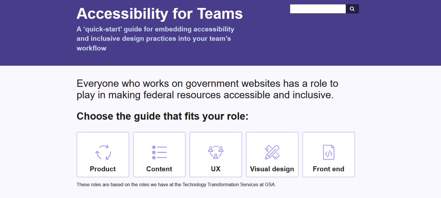
Accessibility for Teams
A ‘quick-start’ guide for embedding accessibility and inclusive design practices into your team’s workflow - for Product management, Content design, UX design, Visual design, and Front-end development teams
 TOOLS
TOOLS

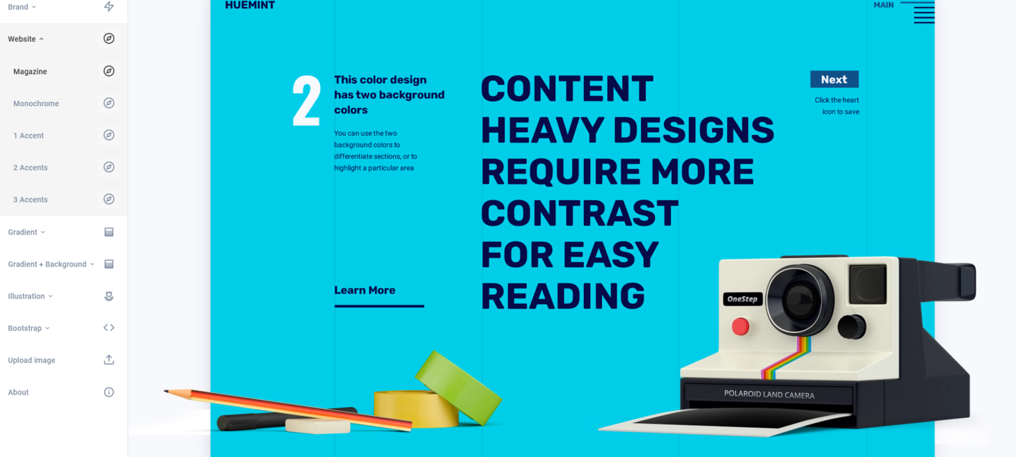
Huemint - Color palette generator for brands, websites and graphics
There are a lot of color generation tools on the web, but most of them generate a flat palette of 5 colors. This is great as a starting point, but it still takes experience and intuition to apply these colors properly.
Huemint is a machine-learning system for generating colors based on context, ready to be used in the final design. It shows which colors are meant to be the background, which are meant to be the foreground, and which are meant to be accents.
 UNTIL NEXT TIME
I hope you enjoyed this issue of Being Designerly with curated articles about Amazon's innovation process, false empathy, documenting accessibility, accessibility for different teams, climate spiral visualization and a free color palette generator for brands, websites and graphics.
Thank you for subscribing! If you think someone would benefit from Being Designerly, please forward it to them.
I'm looking for feedback, of the brutally honest kind, so this newsletter can improve over time. You can reach me at lycerejo (at) gmail.com - thank you!
